Captain Crozier
Vault: Leadership
-
Joined
-
Last visited
Everything posted by Captain Crozier
-
Rhizo - 130 Hertt - 109 AngelCruzdelaSant - 87 Bull of Doom - 74 ABigDeer - 66 Theophilos - 50 bgorre - 34 welder - 28 310hS5a - 25 murphpk - 16 flyhigh734 - 16 Montosh - 13 TheWanderer - 11 Blaskowicz - 7 Chafire - 11 Road2Victory-13 Richard VII - 5 Edward - 4 Kaziocore - 3 Mandarijn - 3 Davian - 2 CC - 2 Robert2424 - 1 Lorikz Kain - 1 Daniel Vigrid - 1 Curufinwe - 1 MacGregor-1 Devon Belial - 1 Zephon09 - 1 cmdrnchf - 1 turtwig9 - 1 Reaper808 - 1 Epitome - 1 Competition? ... "loose" use of the term!
-
Rhizo - 130 Hertt - 109 AngelCruzdelaSant - 87 Bull of Doom - 74 ABigDeer - 66 Theophilos - 50 bgorre - 34 welder - 28 310hS5a - 25 murphpk - 16 flyhigh734 - 16 Montosh - 13 TheWanderer - 11 Blaskowicz - 7 Chafire - 11 Road2Victory-12 Richard VII - 5 Edward - 4 Kaziocore - 3 Mandarijn - 3 Davian - 2 Robert2424 - 1 Lorikz Kain - 1 Daniel Vigrid - 1 Curufinwe - 1 MacGregor-1 Devon Belial - 1 Zephon09 - 1 cmdrnchf - 1 turtwig9 - 1 Reaper808 - 1 Epitome - 1 CC - 1 used to be good at this looks like I might have some competition with R2V!
-
FML ... unfamiliar, guessing screw my life ... close? Any indications this is the end of it? Are they looking for a replacement or to "make do"? I'm sure you are making a good show for yourself, but don't be afraid to arrange things so when it's time to go looking that others can see it too! Good Times don't last forever OR always return after a rough patch. I'm not saying "Plan on leaving", I'm saying plan so that IF you leave, it can be easier rather than harder. Good Luck, Shah! CC
-
Oh Boy, overtime, same pay! Good Luck my friend. Stay Cool. CC
-
Using the new design! Much easier to appreciate in the larger size. Is that a resolution issue? When it's small, like when viewing the nation page, the details bleed together, especially the edges, which are otherwise exceptional!
-
The first one WAS funny .... pew, pew, pew, pew .... shoot 'em up! Last is nice too
-
What I love in the emu one is that it looks like a face reflected to the upper right of the NA continent. Like someone relected on a shiny surface. It's eery cool.
-
Clue UP: IF my Father or Mother or Brother or Sister went into the cop's car as did this one in Ferguson and grabbed the cops gun to wrest it from his control, THEY should be DEAD. IF they then ran away only to turn around and then charge the officer in a furher attempt to again assault the officer in lawful pursuit of them who had broken the law, they should be doubly dead. MY FAMILY, all of them DEAD. Read it and WEAP. I WOULD, it would still be justified.... oh, yeah, AND, they are white!
-
Just as well, mutton heads!
-
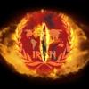
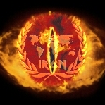
!? How long was that discussion about just one war flag ???!!! Heh, heh, sure, make it happenDoesn't matter to me. Get one up for the choosing ... we're gonna need it soon by the feel of things. THAT and take down the old one.Thanks ccabal86! Appreciate the perspectiveI don't know about change or oldbies, but there's a flag labeled war flag. We go to war, I'm putting it up. IF it ain't our war flag, might ought take it down. Jus' sayin'Does Blade know that? There is a flag labeled IRON war flag. FYI <shrug>Take something for that, would ya? ...oh, and happy birthday!Looks to be a long HARD winter! with no room for sarcasm and cold chill for the good HUMOR bar!I say the penguin is not fighting back so ... must be enjoying it!!Alright, I tried them both. The 200 just didn't hold the resolution well enough, so I went with the crisper one. Seems good despite the recommendation of the avatar instructions. Thank You! Anything I can do for you? ... not art... obviously CCHEY NOW!!! That's Alllll right!! So my quandary, those both look the same but they are different. I like the crispness in the first one above. The second one you've posted as 200X200... how does that play in practice and how is it different from the first one? The avatar limit is 250X right? IF the first one is smaller, and I choose it for crispness, what happens at the borders? 250 minus ... guess I could just try, eh!Yikes the second set is beginning to look like IRON cataracts!!! That'll never do 8^))) What I do love about them is how the wreath sets the boundary of the eyeball. That contrast is missing in the first one. What I LOVE in the first one is the continuation of color ( fire? ) to the edges, past the IRON logo! Sweet!! This one looks good. I'm temped to ask about brightening up the logo a notch or two but I'm afraid of losing the eye! There really isn't much in the way of contrast, so I don't want to hide the subtle premise to push the main plot. However, could we condense the eye behind the IRON logo and put more of it behind? I'm thinking maybe... 5 percent in the SAME area as the current mask of the IRON? That would give me some black at the corners for sure but more to the point it would give me more of the round eye ball look which is currently cut off at the top and probably lower the iris into the crotch of the wreath in the IRON mask. I don't know how that will look, but I'd like to see it. Is that doable? ... Oh, I see, looking at it again, if you condense it the iris probably doesn't drop relative to the wreath. That's ok, I'm looking at the round factor. It will move the wreath a bit outside the eye. Still can't figure how it'll look. Like to see. ;^) CCHmmm, well disappointed about the animation but I can be down with it. So consider this: The first one with the shading box, since it's an avatar, can it be cropped at the shading box to avatar size at the box? What would that look like? The second one is good but wouldn't want to see white in the corners of the avatar outside eye/IRON logo ... whadya think by way of solution for that? Some kind of blend into the corners? Thanks, CCAny active artists up for this?Requesting: Avatar Picture to be included. All seeing eye from Lord of the Rings as background, eye only can be found here: ( Alright, copy function inoperable, try bing search, Lord of the Rings, All seeing eye ) That would be the background with the IRON logo superimposed like a contact lens on eye. Might have to invert the color of the IRON logo or outline it in black to get it to stand out. IF outlined should be only just enough to make it pop but not obscure the eye, so ideally, the IRON logo should be opaque instead of solid, like a contact lens would be. http://1.bp.blogspot.com/-MtSstBScfZQ/TzlX5shDsEI/AAAAAAAABS0/c8Zxz0PjeVA/s1600/Eye-of-Sauron,-Lord-of-the-Rings,-Return-of-the-King.jpg Alright so, got a pic in here, will that do? So Shahenshah has a great example of a scrolling IRON logo in his signature that would make a great starting place for a contact mask, especially if it could roll all the way around rather than off the off the bottom and then onto the top!.. but the black has to come out of the background and the iron logo maybe has to get outlined or opagued so it sets off against the eye without obscuring it. This: http://s7.postimg.org/yd4pijuvv/ironsig.gif