Those look pretty awesome, I'd just like to request a few changes:
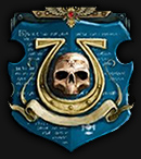
1, We should go off the second image for the avatar too, to have the kind of "synced" look with the signature. Pretty much like I have now.
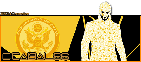
2, I think it would be better if the guy's, head didn't stick out, but would totally be "in" the frame. The sig itself could have the same dimensions as my current one.
3, Maybe we could swap the State Department logo with a black IRON logo? If that doesn't look good, Let's just put "ccabal86" and "IRON" in there somwhere with smaller fonts and without any sort of logo.
4, No need to include "IRON Councilor" in the sig anywhere, as I'm planning to use it for a long time, and I may not be in Council for the entirety of that duration.
Thanks! 
![]()




 Sign In
 Create Account

 This topic is locked




 Back to top