Jump to content

Welcome to IRON Forums Website
Register now to gain access to all of our features. Once registered and logged in, you will be able to create topics, post replies to existing threads, give reputation to your fellow members, get your own private messenger, post status updates, manage your profile and so much more. If you already have an account, login here - otherwise create an account for free today!
Photo

Avatar Request


  • Please log in to reply
14 replies to this topic

#1
Captain Crozier

Captain Crozier

    IRON Rose

  • Vault: Leadership
  • 13,748 posts
  • Resources:
  • CN Nation ID:374610
  • Souls Baptized:7,459,493
  • Squadron:Kilo

Requesting:  Avatar

Picture to be included.  All seeing eye from Lord of the Rings as background, eye only can be found here: ( Alright, copy function inoperable, try bing search, Lord of the Rings, All seeing eye )  That would be the background with the IRON logo superimposed like a contact lens on eye.  Might have to invert the color of the IRON logo or outline it in black to get it to stand out.  IF outlined should be only just enough to make it pop but not obscure the eye, so ideally, the IRON logo should be opaque instead of solid, like a contact lens would be.


Eye-of-Sauron,-Lord-of-the-Rings,-Return


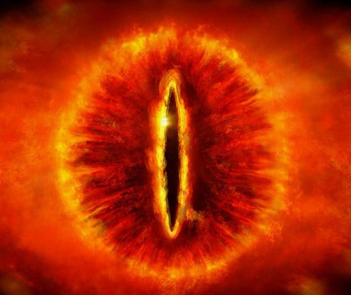
Alright so, got a pic in here, will that do?


So Shahenshah has a great example of a scrolling IRON logo in his signature that would make a great starting place for a contact mask, especially if it could roll all the way around rather than off the off the bottom and then onto the top!.. but the black has to come out of the background and the iron logo maybe has to get outlined or opagued so it sets off against the eye without obscuring it.

This:

ironsig.gif


374610-iron.png


Awards Bar:

Users Awards

#2
Captain Crozier

Captain Crozier

    IRON Rose

  • Vault: Leadership
  • 13,748 posts
  • Resources:
  • CN Nation ID:374610
  • Souls Baptized:7,459,493
  • Squadron:Kilo

Any active artists up for this?


374610-iron.png


Awards Bar:

Users Awards

#3
Fox Fire

Fox Fire

    Vice-Chair of the Lobster Party

  • NM⎪Inactive
  • 3,767 posts
  • Resources:
  • CN Nation ID:527884
  • Souls Baptized:1,083,443
  • Squadron:Foxtrot
  • Discord ID:Fox Fire
I keep ending up with this ugly looking thing:

PicsArt_1411669265140_zpsogrqmh5m.jpg

I can't figure out why the faint box around the logo keeps appearing when I apply it.
I'll try some other things.

Posted Image

Posted Image

Posted Image


Awards Bar:

Users Awards

#4
Fox Fire

Fox Fire

    Vice-Chair of the Lobster Party

  • NM⎪Inactive
  • 3,767 posts
  • Resources:
  • CN Nation ID:527884
  • Souls Baptized:1,083,443
  • Squadron:Foxtrot
  • Discord ID:Fox Fire
Here's another attempt with a different image:

PicsArt_1411670130789_zpsfer24gn5.jpg

Posted Image

Posted Image

Posted Image


Awards Bar:

Users Awards

#5
Captain Crozier

Captain Crozier

    IRON Rose

  • Vault: Leadership
  • 13,748 posts
  • Resources:
  • CN Nation ID:374610
  • Souls Baptized:7,459,493
  • Squadron:Kilo

Hmmm, well disappointed about the animation but I can be down with it.  So consider this:  The first one with the shading box, since it's an avatar, can it be cropped at the shading box to avatar size at the box?  What would that look like?  The second one is good but wouldn't want to see white in the corners of the avatar outside eye/IRON logo ... whadya think by way of solution for that?  Some kind of blend into the corners?  Thanks,

CC  B)


374610-iron.png


Awards Bar:

Users Awards

#6
Fox Fire

Fox Fire

    Vice-Chair of the Lobster Party

  • NM⎪Inactive
  • 3,767 posts
  • Resources:
  • CN Nation ID:527884
  • Souls Baptized:1,083,443
  • Squadron:Foxtrot
  • Discord ID:Fox Fire
PicsArt_1411673354615_zpscugawfw8.jpg

Cropped.
The other one I have play with a bit.

Posted Image

Posted Image

Posted Image


Awards Bar:

Users Awards

#7
Fox Fire

Fox Fire

    Vice-Chair of the Lobster Party

  • NM⎪Inactive
  • 3,767 posts
  • Resources:
  • CN Nation ID:527884
  • Souls Baptized:1,083,443
  • Squadron:Foxtrot
  • Discord ID:Fox Fire
So I made the background black. Then that made the edges pixelated. So I had to add a mask effect so it wouldn't look too crappy. This is what happens when you don't have photoshop.

PicsArt_1411674041058_zpskiaocap8.jpg

PicsArt_1411674279611_zpsg97nimlw.jpg

Edited by Fox Fire, 25 September 2014 - 07:49 PM.

Posted Image

Posted Image

Posted Image


Awards Bar:

Users Awards

#8
Captain Crozier

Captain Crozier

    IRON Rose

  • Vault: Leadership
  • 13,748 posts
  • Resources:
  • CN Nation ID:374610
  • Souls Baptized:7,459,493
  • Squadron:Kilo

Yikes the second set is beginning to look like IRON cataracts!!!  That'll never do  8^)))

What I do love about them is how the wreath sets the boundary of the eyeball.  That contrast is missing in the first one.


What I LOVE in the first one is the continuation of color ( fire? ) to the edges, past the IRON logo!  Sweet!!   This one looks good.  I'm temped to ask about brightening up the logo a notch or two but I'm afraid of losing the eye!  There really isn't much in the way of contrast, so I don't want to hide the subtle premise to push the main plot.  However, could we condense the eye behind the IRON logo and put more of it behind?  I'm thinking maybe... 5 percent in the SAME area  as the current mask of the IRON?  That would give me some black at the corners for sure but more to the point it would give me more of the round eye ball look which is currently cut off at the top and probably lower the iris into the crotch of the wreath in the IRON mask.  I don't know how that will look, but I'd like to see it.  Is that doable?

...

Oh, I see, looking at it again, if you condense it the iris probably doesn't drop relative to the wreath.  That's ok, I'm looking at the round factor.  It will move the wreath a bit outside the eye.  Still can't figure how it'll look.  Like to see.  ;^)


CC 


374610-iron.png


Awards Bar:

Users Awards

#9
Fox Fire

Fox Fire

    Vice-Chair of the Lobster Party

  • NM⎪Inactive
  • 3,767 posts
  • Resources:
  • CN Nation ID:527884
  • Souls Baptized:1,083,443
  • Squadron:Foxtrot
  • Discord ID:Fox Fire
PicsArt_1411680023504_zpsql1j1a2x.jpg

Trying to brighten it up a bit. Still looks like crap.

Yikes the second set is beginning to look like IRON cataracts!!!  That'll never do  8^)))
What I do love about them is how the wreath sets the boundary of the eyeball.  That contrast is missing in the first one.
 
What I LOVE in the first one is the continuation of color ( fire? ) to the edges, past the IRON logo!  Sweet!!   This one looks good.  I'm temped to ask about brightening up the logo a notch or two but I'm afraid of losing the eye!  There really isn't much in the way of contrast, so I don't want to hide the subtle premise to push the main plot.  However, could we condense the eye behind the IRON logo and put more of it behind?  I'm thinking maybe... 5 percent in the SAME area  as the current mask of the IRON?  That would give me some black at the corners for sure but more to the point it would give me more of the round eye ball look which is currently cut off at the top and probably lower the iris into the crotch of the wreath in the IRON mask.  I don't know how that will look, but I'd like to see it.  Is that doable?
...
Oh, I see, looking at it again, if you condense it the iris probably doesn't drop relative to the wreath.  That's ok, I'm looking at the round factor.  It will move the wreath a bit outside the eye.  Still can't figure how it'll look.  Like to see.  ;^)
 
CC 


I actually was messing with that and it didn't look so good. But I can make another one and show you.

Posted Image

Posted Image

Posted Image


Awards Bar:

Users Awards

#10
Fox Fire

Fox Fire

    Vice-Chair of the Lobster Party

  • NM⎪Inactive
  • 3,767 posts
  • Resources:
  • CN Nation ID:527884
  • Souls Baptized:1,083,443
  • Squadron:Foxtrot
  • Discord ID:Fox Fire
Well, I figured out how to make that faint box go away. I guess it had something to do with placing a png over another png. So I made the background a jpeg and tried again.
This time the IRON logo is positioned higher and the overall picture is less cropped to leave some black edges.

PicsArt_1411680832085_zpsksxksekm.jpg

Posted Image

Posted Image

Posted Image


Awards Bar:

Users Awards

#11
Fox Fire

Fox Fire

    Vice-Chair of the Lobster Party

  • NM⎪Inactive
  • 3,767 posts
  • Resources:
  • CN Nation ID:527884
  • Souls Baptized:1,083,443
  • Squadron:Foxtrot
  • Discord ID:Fox Fire
200x200

PicsArt_1411681088522_zpsueoqbmsx.jpg

Posted Image

Posted Image

Posted Image


Awards Bar:

Users Awards

#12
Captain Crozier

Captain Crozier

    IRON Rose

  • Vault: Leadership
  • 13,748 posts
  • Resources:
  • CN Nation ID:374610
  • Souls Baptized:7,459,493
  • Squadron:Kilo

HEY NOW!!! That's Alllll right!!  So my quandary, those both look the same but they are different. 

I like the crispness in the first one above. The second one you've posted as 200X200... how does that play in practice and how is it different from the first one?

The avatar limit is 250X right?

IF the first one is smaller, and I choose it for crispness, what happens at the borders?  250 minus ... guess I could just try, eh!  :D


374610-iron.png


Awards Bar:

Users Awards

#13
Fox Fire

Fox Fire

    Vice-Chair of the Lobster Party

  • NM⎪Inactive
  • 3,767 posts
  • Resources:
  • CN Nation ID:527884
  • Souls Baptized:1,083,443
  • Squadron:Foxtrot
  • Discord ID:Fox Fire

HEY NOW!!! That's Alllll right!!  So my quandary, those both look the same but they are different. 
I like the crispness in the first one above. The second one you've posted as 200X200... how does that play in practice and how is it different from the first one?
The avatar limit is 250X right?
IF the first one is smaller, and I choose it for crispness, what happens at the borders?  250 minus ... guess I could just try, eh!  :D

I'm not really sure if smaller avatars are blown up when uploaded or not. I imagine not.
The 200x200 is just slightly blown up. But without Photoshop or something, I can't.increase the size without pixelating it.

Posted Image

Posted Image

Posted Image


Awards Bar:

Users Awards

#14
Captain Crozier

Captain Crozier

    IRON Rose

  • Vault: Leadership
  • 13,748 posts
  • Resources:
  • CN Nation ID:374610
  • Souls Baptized:7,459,493
  • Squadron:Kilo

Alright, I tried them both.  The 200 just didn't hold the resolution well enough, so I went with the crisper one.  Seems good despite the recommendation of the avatar instructions. 


Thank You!  Anything I can do for you? ... not art... obviously  ;)


CC  B)


374610-iron.png


Awards Bar:

Users Awards

#15
Fox Fire

Fox Fire

    Vice-Chair of the Lobster Party

  • NM⎪Inactive
  • 3,767 posts
  • Resources:
  • CN Nation ID:527884
  • Souls Baptized:1,083,443
  • Squadron:Foxtrot
  • Discord ID:Fox Fire
Nope, I'm fine. Enjoy. :)

Posted Image

Posted Image

Posted Image


Awards Bar:

Users Awards


1 user(s) are reading this topic

0 members, 1 guests, 0 anonymous users